 组件化开发
组件化开发
# 1 组件化开发
# 1.1 什么是组件化开发
组件化开发 指的是:根据封装的思想,把页面上 可重用的部分 封装为 组件,从而方便项目的 开发 和 维护。
一个页面, 可以拆分成一个个组件,一个组件就是一个整体, 每个组件可以有自己独立的 结构 样式 和 行为
例如:http://www.ibootstrap.cn/ 所展示的效果,就契合了组件化开发的思想。
用户可以通过拖拽组件的方式,快速生成一个页面的布局结构。
前端组件化开发的好处主要体现在以下两方面:
提高了前端代码的复用性和灵活性
提升了开发效率和后期的可维护性
vue 是一个完全支持组件化开发的框架。vue 中规定组件的后缀名是 .vue。
# 1.2 组件的注册
刚才我们创建使用的是 App.vue 根组件, 这个比较特殊, 是最大的一个根组件
而App.vue根组件内, 还可以写入一些小组件, 而这些组件, 要使用, 就需要先注册!
注册组件有两种注册方式: 分为“全局注册”和“局部注册”两种
- 被全局注册的组件,可以在任意的组件模板范围中使用 通过
Vue.component() - 被局部注册的组件,只能在当前注册的组件模板范围内使用 通过
components
# 1.2.1 局部注册
- 把独立的组件封装一个
.vue文件中,推荐放到components文件夹
components
  -- HmHeader.vue
  -- HmContent.vue
  -- HmFooter.vue
2
3
4
- 通过组件的
components配置 局部注册组件
import HmHeader from './components/HmHeader'
import HmContent from './components/HmContent'
import HmFooter from './components/HmFooter'

export default {
  // data methods filters computed watch
  components: {
    // 组件名: 组件
    // 组件名:注意,不能和html内置的标签重名
    // 使用的时候:直接通过组件名去使用
    // HmHeader  HmHeader  hm-header
    HmHeader,
    HmContent,
    HmFooter
  }
}
2
3
4
5
6
7
8
9
10
11
12
13
14
15
16
==注意点:注册的组件的名字不能和HTML内置的标签重名==
- 可以在模板中使用组件,,,,使用组件和使用html的标签是一样的,,,可以多次使用
<template>
  <div>
    <!-- 组件注册好了,就跟使用html标签一样了 -->
    <hm-header></hm-header>
    <hm-content></hm-content>
    <hm-footer></hm-footer>
  </div>
</template>
2
3
4
5
6
7
8
==局部注册的组件只能在当前组件中使用==
# 1.2.2 全局注册
- 在
components文件夹中创建一些新的组件
components
  -- HmHeader.vue
  -- HmContent.vue
  -- HmFooter.vue
2
3
4
- 在
main.js中通过Vue.component()全局注册组件
import HmHeader from './components/HmHeader'
import HmContent from './components/HmContent'
import HmFooter from './components/HmFooter'

// 全局注册
// Vue.component(名字, 组件)
Vue.component('HmHeader', HmHeader)
Vue.component('HmContent', HmContent)
Vue.component('HmFooter', HmFooter)
2
3
4
5
6
7
8
9
- 使用
<template>
  <div>
    <!-- 组件注册好了,就跟使用html标签一样了 -->
    <hm-header></hm-header>
    <hm-content></hm-content>
    <hm-footer></hm-footer>
  </div>
</template>
2
3
4
5
6
7
8
==注意:全局注册的组件 可以在任意的组件中去使用==
# 1.2.2.1 组件名的大小写
在进行组件的注册时,定义组件名的方式有两种:
注册使用短横线命名法,例如 hm-header 和 hm-main
Vue.component('hm-button', HmButton)1使用时
<hm-button> </hm-button>注册使用大驼峰命名法,例如 HmHeader 和 HmMain
Vue.component('HmButton', HmButton)1使用时
<HmButton> </HmButton>和<hm-button> </hm-button>都可以
推荐定义组件名时, 用大驼峰命名法, 更加方便
全局注册
Vue.component('HmButton', HmButton)
局部注册:
components: {
  HmHeader,
  HmMain,
  HmFooter
}
2
3
4
5
使用时, 推荐遵循html5规范, 小写横杠隔开
<hm-header></hm-header>
<hm-main></hm-main>
<hm-footer></hm-footer>
2
3
# 1.2.2.1 通过 name 注册组件 (了解)
组件在开发者工具中显示的名字可以通过name进行修改
在注册组件期间,除了可以直接提供组件的注册名称之外,还可以把组件的 name 属性作为注册后组件的名称
组件内容:
<template>
  <button>按钮组件</button>
</template>

<script>
export default {
  name: 'HmButton'
}
</script>

<style lang="less">
button {
  width: 80px;
  height: 50px;
  border-radius: 5px;
  background-color: pink;
}
</style>
2
3
4
5
6
7
8
9
10
11
12
13
14
15
16
17
18
进行注册:
import HmButton from './components/hm-button.vue'
Vue.component(HmButton.name, HmButton)  // 等价于 app.component('HmButton', HmButton)
2
# 1.3 组件的样式冲突 scoped
默认情况下,写在组件中的样式会全局生效,因此很容易造成多个组件之间的样式冲突问题。
组件样式默认会作用到全局, 就会影响到整个 index.html 中的 dom 元素
全局样式: 默认组件中的样式会作用到全局局部样式: 可以给组件加上 scoped 属性, 可以让样式只作用于当前组件
<style lang="less" scoped>
div {
  background-color: pink;
}
</style>
2
3
4
5
原理:
添加scoped后, 会给当前组件中所有元素, 添加上一个自定义属性
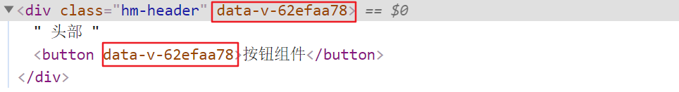
添加scoped后, 每个style样式, 也会加上对应的属性选择器
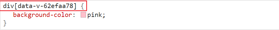
最终效果: 必须是当前组件的元素, 才会有这个自定义属性, 才会被这个样式作用到
# 2 组件通信
每个组件都有自己的数据, 提供在data中, 每个组件的数据是独立的, 组件数据无法互相直接访问 (合理的)
但是如果需要跨组件访问数据, 就需要用到组件通信
组件通信的方式有很多: 现在先关注两种, 父传子 子传父
# 2.1 组件通信 - 父传子 props 传值
语法:
- 父组件通过给子组件加属性传值
<Son price="100" title="不错" :info="msg"></Son>
- 子组件中, 通过props属性接收
props: ['price', 'title', 'info']
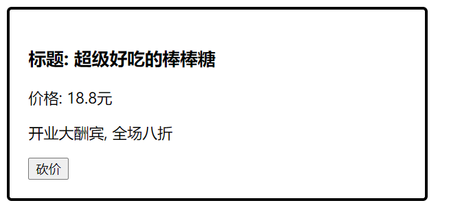
需求: 封装一个商品组件 my-product
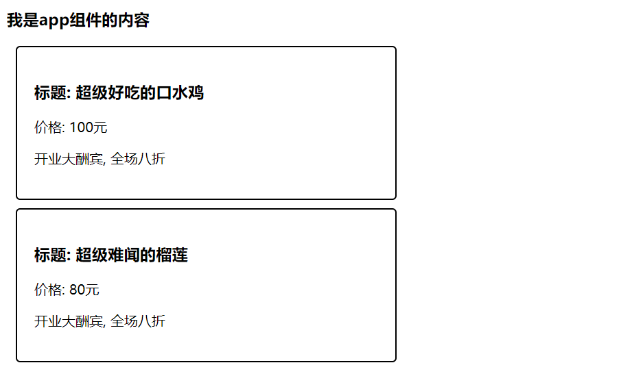
my-product.vue
<template>
  <div class="my-product">
    <h3>标题: {{ title }}</h3>
    <p>价格: {{ price }}元</p>
    <p>{{ info }}</p>
  </div>
</template>

<script>
export default {
  props: ['title', 'price', 'info']
}
</script>

<style>
.my-product {
  width: 400px;
  padding: 20px;
  border: 2px solid #000;
  border-radius: 5px;
  margin: 10px;
}
</style>
2
3
4
5
6
7
8
9
10
11
12
13
14
15
16
17
18
19
20
21
22
23
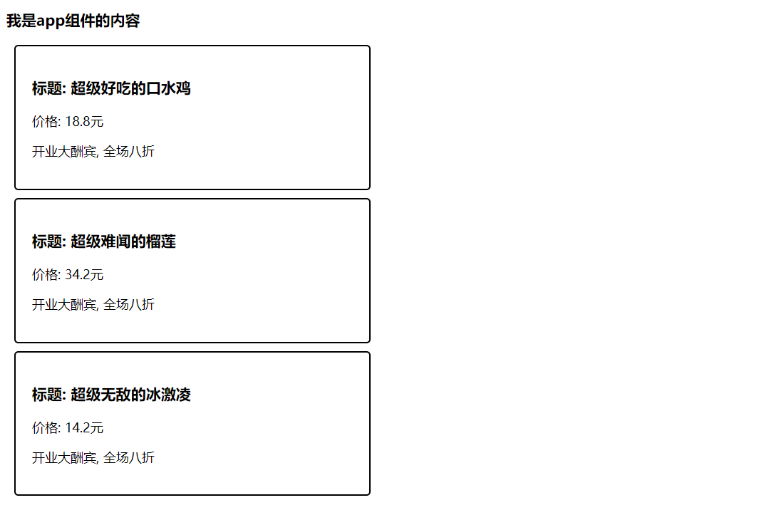
# 2.2 v-for 遍历展示组件
需求: 遍历展示商品列表
假定, 发送请求回来的商品数据,
list: [
  { id: 1, proname: '超级好吃的棒棒糖', proprice: 18.8 },
  { id: 2, proname: '超级好吃的大鸡腿', proprice: 34.2 },
  { id: 3, proname: '超级无敌的冰激凌', proprice: 14.2 }
]
2
3
4
5
v-for 遍历展示
<template>
  <div class="container">
    <h3>我是app组件的内容</h3>
    <my-product
      v-for="item in list" :key="item.id"
      :price="item.proprice"
      :title="item.proname"
      :info="msg">
    </my-product>
  </div>
</template>
2
3
4
5
6
7
8
9
10
11
# 2.3 单向数据流
/*
  在vue中需要遵循单向数据流原则
  1. 父组件的数据发生了改变,子组件会自动跟着变
  2. 子组件不能直接修改父组件传递过来的props  props是只读的
*/
2
3
4
5
==如果父组件传给子组件的是一个对象,子组件修改对象的属性,是不会报错的,,,,也应该避免==
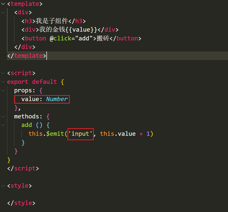
# 2.4 组件通信 - 子传父
需求: 砍价
子组件可以通过
this.$emit('事件名', 参数1, 参数2, ...)触发事件的同时传参的this.$emit('sayPrice', 2)1父组件给子组件注册一个自定义事件
<my-product
  ...
  @sayPrice="sayPrice">
</my-product>
1
2
3
4父组件并提供对应的函数接收参数
methods: {
  sayPrice (num) {
    console.log(num)
  }
},
1
2
3
4
5
# 2.5 props 校验
props 是父传子, 传递给子组件的数据, 为了提高 子组件被使用时 的稳定性, 可以进行props校验, 验证传递的数据是否符合要求
默认的数组形式, 不会进行校验, 如果希望校验, 需要提供对象形式的 props
风格指南:https://cn.vuejs.org/v2/style-guide/#Prop-%E5%AE%9A%E4%B9%89%E5%BF%85%E8%A6%81
props: {
	...
}
2
3
props 提供了多种数据验证方案,例如:
- 基础的类型检查 Number
- 多个可能的类型 [String, Number]
- 必填项校验 required: true
- 默认值 default: 100
- 自定义验证函数
官网语法: 地址 (opens new window)
{
  props: {
    // 基础的类型检查
    propA: Number,
    // 多个可能的类型
    propB: [String, Number],
    // 必填的字符串
    propC: {
      type: String,
      required: true
    },
    // 带有默认值的数字
    propD: {
      type: Number,
      default: 100
    },
    // -------------------------------------------------------------------------
    // 自定义验证函数
    propF: {
      validator: function (value) {
        // 这个值必须匹配下列字符串中的一个
        return ['success', 'warning', 'danger'].indexOf(value) !== -1
      }
    }
  }
}
2
3
4
5
6
7
8
9
10
11
12
13
14
15
16
17
18
19
20
21
22
23
24
25
26
# 3 任务列表案例
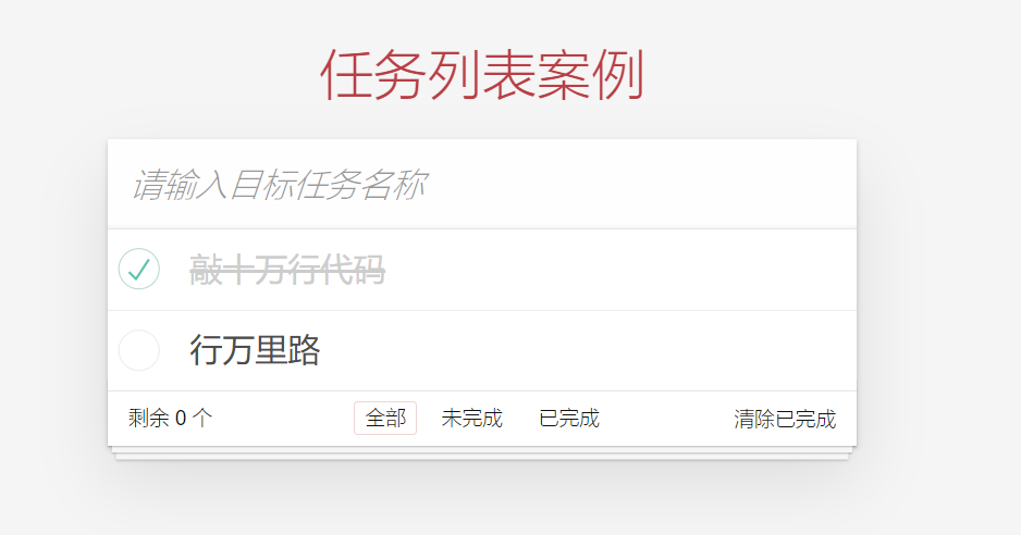
# 3.1 封装组件
封装三个组件
TodoHeader.vue, TodoMain.vue, TodoFooter.vue在
App.vue局部注册三个组件
import TodoHeader from './components/TodoHeader'
import TodoMain from './components/TodoMain'
import TodoFooter from './components/TodoFooter'
export default {
  // 局部注册组件
  components: {
    TodoHeader,
    TodoMain,
    TodoFooter
  },
}
2
3
4
5
6
7
8
9
10
11
- 在
App.vue渲染3个组件
<template>
  <section class="todoapp">
    <todo-header></todo-header>
    <todo-main></todo-main>
    <todo-footer></todo-footer>
  </section>
</template>
2
3
4
5
6
7
- 在
main.js中导入通用的样式
import './styles/base.css'
import './styles/index.css'
2
# 3.2 列表的渲染
- 在
App.vue提供了任务列表数据
data () {
  return {
    list: [
      { id: 1, name: '吃饭', isDone: true },
      { id: 2, name: '睡觉', isDone: false },
      { id: 3, name: '打豆豆', isDone: true }
    ]
  }
}
2
3
4
5
6
7
8
9
- App.vue通过父传子,把list数据传给
TodoMain.vue
    <!-- 父传子 -->
    <todo-main :list="list"></todo-main>
2
TodoMain.vue接受数据,且渲染
props: {
  list: {
    type: Array,
    required: true,
  },
},

<ul class="todo-list">
  <!-- completed: 完成的类名 -->
  <li :class="{completed: item.isDone}" v-for="item in list" :key="item.id">
    <div class="view">
      <input class="toggle" type="checkbox" v-model="item.isDone">
      <label>{{item.name}}</label>
      <button class="destroy"></button>
    </div>
    <input class="edit" value="Create a TodoMVC template">
  </li>
</ul>
2
3
4
5
6
7
8
9
10
11
12
13
14
15
16
17
18
# 3.3 任务删除功能
- 给删除按钮注册点击事件
<button class="destroy" @click="del(item.id)"></button>
- 通过$emit把值传给父组件
methods: {
  del (id) {
    // console.log(id)
    this.$emit('del', id)
  }
}
2
3
4
5
6
- 父组件给子组件注册事件
<todo-main :list="list" @del="delFn"></todo-main>
- 父组件通过回调函数接受参数
methods: {
  delFn (id) {
    // 把id过滤掉
    this.list = this.list.filter(item => item.id !== id)
  }
}
2
3
4
5
6
# 3.4 任务状态修改功能
- 把
v-model改成了:checked
v-model和父组件双向数据绑定,违反单向数据流的原则。
<input class="toggle" type="checkbox" :checked="item.isDone" >
- 给checkbox注册change事件
<input class="toggle" type="checkbox" :checked="item.isDone" @change="change(item.id)">
- 子传父,让父组件修改
change (id) {
  this.$emit('change', id)
}
2
3
- 父组件注册事件
<todo-main :list="list" @del="delFn" @change="changeFn"></todo-main>
- 父组件修改状态
changeFn (id) {
  const result = this.list.find(item => item.id === id)
  result.isDone = !result.isDone
}
2
3
4
# 3.5 任务的添加功能
- 在
TodoHeader.vue组件中通过v-model获取到任务的名字
<input class="new-todo" placeholder="What needs to be done?" autofocus v-model.trim="name">

data () {
  return {
    name: ''
  }
},
2
3
4
5
6
7
- 回车的时候,需要子传父,把名字传给父组件
<input class="new-todo" placeholder="What needs to be done?" autofocus v-model.trim="name" @keyup.enter="add">

methods: {
  add () {
    // 子传父
    this.$emit('add', this.name)
    // 清空内容
    this.name = ''
  }
}
2
3
4
5
6
7
8
9
10
- 父组件接受name,并且添加
<todo-header @add="addFn"></todo-header>

addFn (name) {
  this.list.unshift({
    id: Date.now(),
    name,
    isDone: false
  })
}
2
3
4
5
6
7
8
9
# 3.6 剩余任务的统计功能
- 父传子,把list传给
TodoFooter.vue组件
<todo-footer :list="list"></todo-footer>
- footer组件通过props接收传递过来的数据
props: {
  list: {
    type: Array,
    required: true,
  },
},
2
3
4
5
6
- footer组件提供了一个计算属性,用于统计未完成的任务
computed: {
  leftCount () {
    // 统计的未完成的任务的数量
    return this.list.filter(item => item.isDone === false).length
  }
}
2
3
4
5
6
- 显示剩余任务的条数
<footer class="footer" v-if="list.length > 0">


<span class="todo-count">
  <strong>{{ leftCount }}</strong> item left
</span>
2
3
4
5
6
# 3.7 清空功能
- 提供计算属性,用于控制清空按钮的显示和隐藏
computed: {
  // 获取所有未完成的任务的数量
  leftCount() {
    const arr = this.list.filter((item) => !item.isDone)
    return arr.length
  },
  // 如果list中有一个或者多个完成的任务,就应该显示
  isShowClear() {
    return this.list.some((item) => item.isDone)
  },
},
2
3
4
5
6
7
8
9
10
11
- 通过v-show控制显示隐藏, 注册了点击事件
<button v-show="isShowClear" class="clear-completed" @click="clear">
  Clear completed
</button>
2
3
- 触发clear事件
methods: {
  clear() {
    // 清空已经完成的任务  过滤,保留未完成的任务
    this.$emit('clear')
  },
},
2
3
4
5
6
- 父组件清空已经完成的任务
<TodoFooter :list="list" @clear="clearFn"></TodoFooter>

clearFn() {
  // console.log('清空')
  this.list = this.list.filter((item) => item.isDone === false)
},
2
3
4
5
6
# 3.8 底部筛选功能-点击高亮
- 给3个a注册点击事件
<li>
  <a
+    @click.prevent="filter('all')"
    :class="{ selected: type === 'all' }"
    href="#/"
    >All</a
  >
</li>
<li>
  <a
+    @click.prevent="filter('active')"
    href="#/active"
    :class="{ selected: type === 'active' }"
    >Active</a
  >
</li>
<li>
  <a
+    @click.prevent="filter('completed')"
    href="#/completed"
    :class="{ selected: type === 'completed' }"
    >Completed</a
  >
</li>
2
3
4
5
6
7
8
9
10
11
12
13
14
15
16
17
18
19
20
21
22
23
24
- 准备type数据,记录点击的按钮
data() {
  return {
    type: 'all',
  }
},

filter(type) {
  this.type = type
},
2
3
4
5
6
7
8
9
- 动态控制 selected类名
<li>
  <a
    @click.prevent="filter('all')"
+    :class="{ selected: type === 'all' }"
    href="#/"
    >All</a
  >
</li>
<li>
  <a
    @click.prevent="filter('active')"
    href="#/active"
+    :class="{ selected: type === 'active' }"
    >Active</a
  >
</li>
<li>
  <a
    @click.prevent="filter('completed')"
    href="#/completed"
+   :class="{ selected: type === 'completed' }"
    >Completed</a
  >
</li>
2
3
4
5
6
7
8
9
10
11
12
13
14
15
16
17
18
19
20
21
22
23
24
# 3.9 状态提升
考虑到,过滤条件影响到footer,也会影响到main的展示,需要进行状态提升
- 将type属性 ,**状态提升 **到 父组件
data () {
  return {
    list: [
      { id: 1, name: '吃饭', isDone: false },
      { id: 2, name: '睡觉', isDone: true },
      { id: 3, name: '打豆豆', isDone: false }
    ],
    type: 'all'
  }
},
2
3
4
5
6
7
8
9
10
- 父传子将提升后的状态,传给子组件
// App.vue绑定:
	<hm-footer :type="type"></hm-footer>

// 子组件接收:
    props: {
      list: Array,
      type: String
    },
2
3
4
5
6
7
8
- 子组件触发事件,将修改的type类型传递给父组件
filter (type) {
  // this.type = type
  this.$emit('changeType', type)
}
2
3
4
- 父组件处理更新
<hm-footer @changeType="changeType" :type="type"></hm-footer>
changeType (type) {
  this.type = type
}
2
3
# 3.10 过滤功能完成
提供计算属性完成切换
computed: {
  showList () {
    if (this.type === 'completed') { // 显示已完成
      return this.list.filter(item => item.isDone === true)
    } else if (this.type === 'active') { // 显示未完成
      return this.list.filter(item => item.isDone === false)
    } else {
      return this.list // 全部显示
    }
  }
}
2
3
4
5
6
7
8
9
10
11
# 3.11 本地存储
- 监视数组的变化
watch: {
  list: {
    deep: true,
    handler(newValue) {
      localStorage.setItem('todoList', JSON.stringify(newValue))
    }
  }
}
2
3
4
5
6
7
8
- data中默认使用本地的数据
data(){
    return {
        list: JSON.parse(localStorage.getItem('todoList')) || [],
    }
},
2
3
4
5
# 3.12 全选功能
TodoMain.vue提供一个计算属性,用于控制 全选的状态
isCheckAll() {
  return this.list.every((item) => item.isDone === true)
}
2
3
- 给全选案例v-model双向绑定
<input
  id="toggle-all"
  class="toggle-all"
  type="checkbox"
  v-model="isCheckAll"
/>
2
3
4
5
6
- 计算属性默认无法修改,不支持双向绑定, 修改时子传父
// 要求:list中isDone全部为true,才能是true  否则是false
isCheckAll: {
  get() {
    return this.list.every((item) => item.isDone === true)
  },
  set(value) {
    // console.log(value)
    this.$emit('checkAll', value)
  },
},
2
3
4
5
6
7
8
9
10
- 父组件接受value值,并且修改
<TodoMain
  @checkAll="checkAllFn"
></TodoMain>

checkAllFn(value) {
  this.list.forEach((item) => (item.isDone = value))
},
2
3
4
5
6
7
# 4 v-model
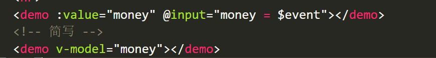
# 4.1 v-model 语法糖
语法糖:v-model本质上是 value属性和input事件的一层包装
v-model的作用:提供数据的双向绑定
- 数据发生了改变,页面会自动变 v-bind:value
- 页面输入改变 , 数据会自动变化 v-on:input
v-model是语法糖, v-model等价于 给一个input框提供了 :value属性以及 @input事件
很显然如果每次使用input框,都需要提供value和input事件,比较麻烦,所以使用v-model
<template>
  <div>
    <input type="text" v-model="msg">
    <input type="text" :value="msg" @input="msg = $event.target.value">

    <input type="text" :value="car" @input="car = $event.target.value">
    <input type="text" v-model="car">
  </div>
</template>
2
3
4
5
6
7
8
9
# 4.2 v-model给组件使用
我们经常遇到一种场景:
- 父组件提供一个数据给子组件使用(父传子)
- 子组件又需要修改父组件传过来的这个数据,所以需要子传父把值传给父组件。
这种场景可以使用v-model进行简写。
- 定义组件的时候,注意接收的值叫value, 子传父触发的事件叫 input
- 父传子给子组件传递value属性和input事件
# 5 ref 和 $refs
利用 ref 和 $refs 可以用于获取 dom 元素, 或者组件实例
每个 vue 的组件实例上,都包含一个$refs 对象,里面存储着对应的DOM 元素或组件的引用。
1 给需要获取的 dom 元素或者组件, 添加 ref 属性
<div>
  <div ref="box">我是div盒子</div>
  <jack ref="jack"></jack>
  <button @click="fn">按钮</button>
</div>
2
3
4
5
2 通过 this.$refs.xxx 获取, 拿到组件可以调用组件的方法
import Jack from './jack.vue'
export default {
  methods: {
    fn () {
      console.log(this.$refs.box)
      console.log(this.$refs.jack)
      this.$refs.jack.sayHi()
    }
  },
  components: {
    Jack
  }
}
2
3
4
5
6
7
8
9
10
11
12
13
# 6 $nextTick
需求1: 点击按钮, 切换显示输入框
<template>
  <div>
    <!-- 需求: 点击按钮, 切换显示输入框 -->
    <input type="text" v-if="isShowInput">
    <button @click="fn" v-else>点此搜索</button>
  </div>
</template>

<script>
export default {
  data () {
    return {
      isShowInput: false
    }
  },
  methods: {
    fn () {
      this.isShowInput = true
    }
  }
}
</script>
2
3
4
5
6
7
8
9
10
11
12
13
14
15
16
17
18
19
20
21
22
需求2: 显示输入框的同时, 要获取焦点
当文本框展示出来之后,如果希望它立即获得焦点,则可以为其添加 ref 引用,并调用原生 DOM 对象的.focus() 方法即可。
直接调用会报错, 因为 vue 是 异步dom更新的 (提升渲染效率), this.isShowInput = true 执行完时, 实际的 dom 还没渲染出来
<input ref="inp" type="text" v-if="isShowInput">

fn () {
  this.isShowInput = true
  this.$refs.inp.focus()
}
2
3
4
5
6
组件的 $nextTick(callback) 方法,会把 callback 回调推迟到下一个 DOM 更新周期之后执行。
通俗的理解是:等组件的DOM 刷新之后,再执行 callback 回调函数。从而能保证 callback 函数可以操作到最新的 DOM 元素。
<template>
  <div>
    <!-- 需求: 点击按钮, 切换显示输入框 -->
    <input ref="inp" type="text" v-if="isShowInput">
    <button @click="fn" v-else>点此搜索</button>
  </div>
</template>

<script>
export default {
  data () {
    return {
      isShowInput: false
    }
  },
  methods: {
    fn () {
      this.isShowInput = true
      this.$nextTick(() => {
        this.$refs.inp.focus()
      })
    }
  }
}
</script>
2
3
4
5
6
7
8
9
10
11
12
13
14
15
16
17
18
19
20
21
22
23
24
25
# 7 dynamic 动态组件
# 7.1 动态组件的基本使用
什么是动态组件: 让多个组件使用同一个挂载点,并动态切换,这就是动态组件
<template>
  <div>
    <h3>动态组件的演示</h3>
    <!-- 动态组件 => 多个组件使用同一个挂载点, 并可以动态的切换展示 -->
    <button @click="comName = 'my-swiper'">swiper</button>
    <button @click="comName = 'my-nav'">nav</button>

    <!--
      <my-nav></my-nav>
      <my-swiper></my-swiper>
    -->
    <component :is="comName"></component>
  </div>
</template>

<script>
import MyNav from './my-nav.vue'
import MySwiper from './my-swiper.vue'
export default {
  data () {
    return {
      comName: 'my-nav'
    }
  },
  components: {
    MyNav,
    MySwiper
  }
}
</script>
2
3
4
5
6
7
8
9
10
11
12
13
14
15
16
17
18
19
20
21
22
23
24
25
26
27
28
29
30
# 8 自定义指令
# 8.1 自定义指令说明
https://www.vue3js.cn/docs/zh/guide/custom-directive.html
除了核心功能默认内置的指令 (v-model 和 v-show),Vue 也允许注册自定义指令。 v-xxx
注意,代码复用和抽象的主要形式是组件。
然而,有的情况下,你仍然需要对普通 DOM 元素进行底层操作,这时候就会用到自定义指令。
# 8.2 自定义指令 - 局部注册
例如需求: 当页面加载时,让元素将获得焦点 , (autofocus 在 safari 浏览器有兼容性)
<template>
  <div>
    <h3>自定义指令</h3>
    <input ref="inp" type="text" v-focus>
  </div>
</template>

<script>
export default {
  directives: {
    // 自定义一个局部指令
    focus: {
      inserted (el) {
        el.focus()
      }
    }
  }
}
</script>
2
3
4
5
6
7
8
9
10
11
12
13
14
15
16
17
18
19
# 8.3 自定义指令 - 全局注册
// 注册全局自定义指令
Vue.directive('focus', {
  inserted (el) {
    el.focus()
  }
})
2
3
4
5
6
# 8.4 自定义指令 - 指令的值
在绑定指令时,可以通过“等号”的形式为指令绑定具体的参数值
需求: v-color="color" 给对应的颜色, 就能改对应的字体颜色
<div v-color="color">我是内容</div>
实现:
directives: {
  // 自定义一个局部指令
  color: {
    // 指令所在的元素渲染的时候
    inserted (el, {value}) {
      el.style.color = value
    },
    // update指令的值改变时触发, binding.value指令的值修改触发
    update (el, binding) {
      el.style.color = binding.value
    }
  }
}
2
3
4
5
6
7
8
9
10
11
12
13
# 9 插槽
插槽(Slot)是 vue 为组件的封装者提供的能力。
允许开发者在封装组件时,把不确定的、希望由用户指定的部分定义为插槽。
# 9.1 默认插槽 slot
需求: 要在页面中显示一个对话框, 封装成一个组件
通过父传子, 固然可以完成一定层面的组件的定制, 但是自定义性较差,
如果希望能够自定义组件内部的一些结构 => 就需要用到插槽
插槽作用: 用于实现组件的内容分发, 通过 slot 标签, 可以接收到写在组件标签内的内容
插槽:slot 作用:占位置
基本示例:
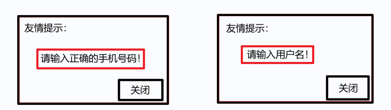
<my-dialog>
  <p>请输入正确的手机号码</p>
</my-dialog>
2
3
my-dialog.vue
<template>
  <div class="my-dialog">
    <div class="header">
      <h3>友情提示</h3>
    </div>
    <div class="content">
      <slot></slot>
    </div>
    <div class="footer">
      <button>关闭</button>
    </div>
  </div>
</template>

<script>
export default {

}
</script>

<style lang="less" scoped>
.my-dialog {
  width: 400px;
  padding: 10px 20px;
  border: 3px solid #000;
  border-radius: 5px;
  margin: 10px;
}
</style>
2
3
4
5
6
7
8
9
10
11
12
13
14
15
16
17
18
19
20
21
22
23
24
25
26
27
28
29
# 9.2 后备内容 (默认值)
封装组件时,可以为预留的 <slot> 插槽提供后备内容(默认内容)。
如果组件的使用者没有为插槽提供任何内容,则后备内容会生效。
<template>
  <div class="my-dialog">
    <div class="header">
      <h3>友情提示</h3>
    </div>
    <div class="content">
      <slot>这是后备内容</slot>
    </div>
    <div class="footer">
      <button>关闭</button>
    </div>
  </div>
</template>
2
3
4
5
6
7
8
9
10
11
12
13
# 9.3 具名插槽
# 9.3.1 插槽的分类:
1 默认插槽(匿名插槽)
<slot></slot> 只要没有具体分发的内容, 都会给到默认插槽
<slot name="default"></slot> 是默认插槽完整的写法 和 <slot></slot> 完全等价
2 具名插槽: 具有名字的插槽 (配置了名字), 可以实现定向分发
一旦配置了名字, 只会接收对应的内容, 不是分发给他的, 就不要
# 9.3.2 具名插槽的使用步骤
(1) 给插槽起名字
<div class="header">
  <slot name="header"></slot>
</div>
<div class="content">
  <slot>这是后备内容</slot>
</div>
<div class="footer">
  <slot name="footer"></slot>
</div>
2
3
4
5
6
7
8
9
(2) 需要使用 template 标签, 将内容包裹成一个整体
(3) 通过 v-slot:插槽名, 指定具体分发给谁
<my-dialog>
  <template v-slot:header>
    <h3>这是大标题</h3>
  </template>

  <template v-slot:default>
    <p>这是内容</p>
  </template>

  <template v-slot:footer>
    <button>确认</button>
    <button>取消</button>
  </template>
</my-dialog>
2
3
4
5
6
7
8
9
10
11
12
13
14
# 9.3.3 具名插槽的简写
跟 v-on 和 v-bind 一样,v-slot 也有缩写,即把参数之前的所有内容 (v-slot:) 替换为字符 #。
例如 v-slot:header 可以被简写为 #header
<my-dialog>
  <template #header>
    <h3>这是大标题</h3>
  </template>

  <template #default>
    <p>这是内容</p>
  </template>

  <template #footer>
    <button>确认</button>
    <button>取消</button>
  </template>
</my-dialog>
2
3
4
5
6
7
8
9
10
11
12
13
14
# 9.4 作用域插槽
作用域插槽: 定义 slot 插槽的同时, 是可以传值的, 将来在分发内容时, 可以使用
- 给 slot 标签, 以 添加属性的方式传值
<slot name="bottom" :yes="yes" :no="no" money="100"></slot>
- 所有添加的属性, 都会被收集到一个对象中
{ yes: '确认', no: '取消', money: '100' }
- 在template中, 通过
v-slot:插槽名= "obj"接收
<template #bottom="obj">
  <!-- {{ obj }} -->
  <button>{{ obj.yes }}</button>
  <button>{{ obj.no }}</button>
  <button>{{ obj.money }}</button>
</template>
2
3
4
5
6
- 可以使用解构赋值简化数据的接收
<template #bottom="{ yes, no, money }">
  <button>{{ yes }}</button>
  <button>{{ no }}</button>
  <button>{{ money }}</button>
</template>
2
3
4
5
# 10 案例 - 商品列表
# 10.1 案例概览
# 10.2 静态结构
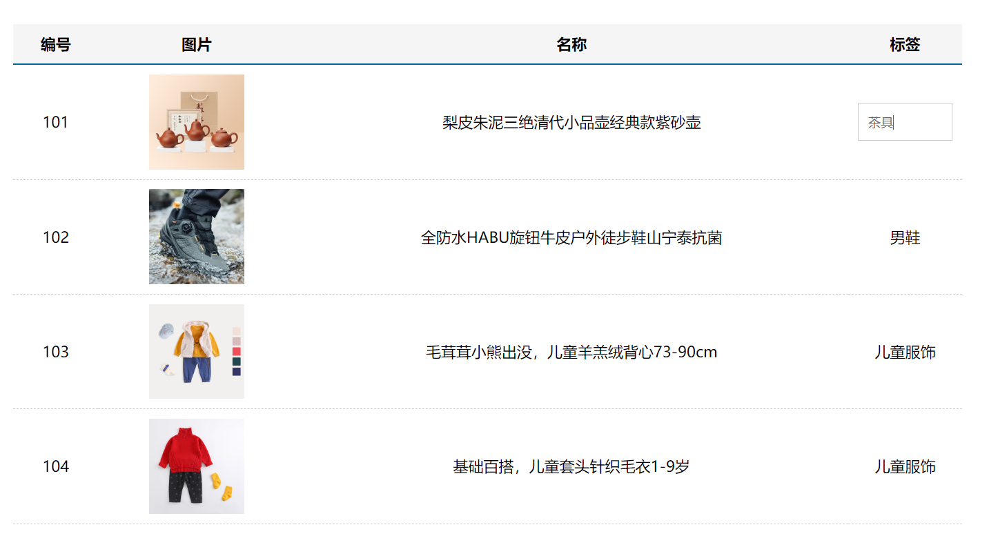
效果图:
直接拷贝到App.vue即可
<template>
<div class="table-case">
<table class="my-table">
<thead>
<tr>
<th>编号</th>
<th>图片</th>
<th>名称</th>
<th width="100px">标签</th>
</tr>
</thead>
<tbody>
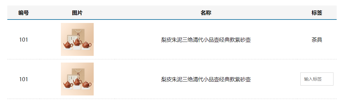
<tr>
<td>101</td>
<td><img src="https://yanxuan-item.nosdn.127.net/f8c37ffa41ab1eb84bff499e1f6acfc7.jpg" /></td>
<td>梨皮朱泥三绝清代小品壶经典款紫砂壶</td>
<td>
<div class="my-tag">
<!-- <input
class="input"
type="text"
placeholder="输入标签"
/> -->
<div class="text">茶具</div>
</div>
</td>
</tr>
<tr>
<td>101</td>
<td><img src="https://yanxuan-item.nosdn.127.net/f8c37ffa41ab1eb84bff499e1f6acfc7.jpg" /></td>
<td>梨皮朱泥三绝清代小品壶经典款紫砂壶</td>
<td>
<div class="my-tag">
<input
class="input"
type="text"
placeholder="输入标签"
/>
<!-- <div class="text">{{ value }}</div> -->
</div>
</td>
</tr>
</tbody>
</table>
</div>
</template>
<script>
export default {
name: 'TableCase',
data () {
return {
goods: [
{ id: 101, picture: 'https://yanxuan-item.nosdn.127.net/f8c37ffa41ab1eb84bff499e1f6acfc7.jpg', name: '梨皮朱泥三绝清代小品壶经典款紫砂壶', tag: '茶具' },
{ id: 102, picture: 'https://yanxuan-item.nosdn.127.net/221317c85274a188174352474b859d7b.jpg', name: '全防水HABU旋钮牛皮户外徒步鞋山宁泰抗菌', tag: '男鞋' },
{ id: 103, picture: 'https://yanxuan-item.nosdn.127.net/cd4b840751ef4f7505c85004f0bebcb5.png', name: '毛茸茸小熊出没,儿童羊羔绒背心73-90cm', tag: '儿童服饰' },
{ id: 104, picture: 'https://yanxuan-item.nosdn.127.net/56eb25a38d7a630e76a608a9360eec6b.jpg', name: '基础百搭,儿童套头针织毛衣1-9岁', tag: '儿童服饰' },
]
}
}
}
</script>
<style lang="less" scoped>
.table-case {
width: 1000px;
margin: 50px auto;
img {
width: 100px;
height: 100px;
object-fit: contain;
vertical-align: middle;
}
}
.my-table {
width: 100%;
border-spacing: 0;
img {
width: 100px;
height: 100px;
object-fit: contain;
vertical-align: middle;
}
th {
background: #f5f5f5;
border-bottom: 2px solid #069;
}
td {
border-bottom: 1px dashed #ccc;
}
td,
th {
text-align: center;
padding: 10px;
transition: all .5s;
&.red {
color: red;
}
}
.none {
height: 100px;
line-height: 100px;
color: #999;
}
}
.my-tag {
cursor: pointer;
.input {
appearance: none;
outline: none;
border: 1px solid #ccc;
width: 100px;
height: 40px;
box-sizing: border-box;
padding: 10px;
color: #666;
&::placeholder {
color: #666;
}
}
}
</style>
2
3
4
5
6
7
8
9
10
11
12
13
14
15
16
17
18
19
20
21
22
23
24
25
26
27
28
29
30
31
32
33
34
35
36
37
38
39
40
41
42
43
44
45
46
47
48
49
50
51
52
53
54
55
56
57
58
59
60
61
62
63
64
65
66
67
68
69
70
71
72
73
74
75
76
77
78
79
80
81
82
83
84
85
86
87
88
89
90
91
92
93
94
95
96
97
98
99
100
101
102
103
104
105
106
107
108
109
110
111
112
113
114
115
116
117
118
119
120
121
122
123
124
# 10.3 封装 MyTag 组件
核心需求:
- 双击显示输入框,并回显标签信息
- 失去焦点,隐藏输入框
- 修改标签信息,回车, 显示修改后的标签文本
# 10.3.1 新建 MyTag 组件
新建 components/MyTag.vue 文件
<template>
  <div class="my-tag">
    <!-- <input
      class="input"
      type="text"
      placeholder="输入标签"
    /> -->
    <div class="text">茶具</div>
  </div>
</template>

<script>
export default {

}
</script>

<style lang="less">
.my-tag {
  cursor: pointer;
  .input {
    appearance: none;
    outline: none;
    border: 1px solid #ccc;
    width: 100px;
    height: 40px;
    box-sizing: border-box;
    padding: 10px;
    color: #666;
    &::placeholder {
      color: #666;
    }
  }
}
</style>
2
3
4
5
6
7
8
9
10
11
12
13
14
15
16
17
18
19
20
21
22
23
24
25
26
27
28
29
30
31
32
33
34
35
App页面中注册使用
<template>
  <div class="table-case">
    <table class="my-table">
      ...
      <tbody>
        <tr>
          <td>101</td>
          <td><img src="https://yanxuan-item.nosdn.127.net/f8c37ffa41ab1eb84bff499e1f6acfc7.jpg" /></td>
          <td>梨皮朱泥三绝清代小品壶经典款紫砂壶</td>
          <td>
            <MyTag></MyTag>
          </td>
        </tr>
      </tbody>
    </table>
  </div>
</template>

<script>
import MyTag from './components/MyTag.vue'

export default {
  name: 'TableCase',
  ...
  components: {
    MyTag
  }
}
</script>
2
3
4
5
6
7
8
9
10
11
12
13
14
15
16
17
18
19
20
21
22
23
24
25
26
27
28
29
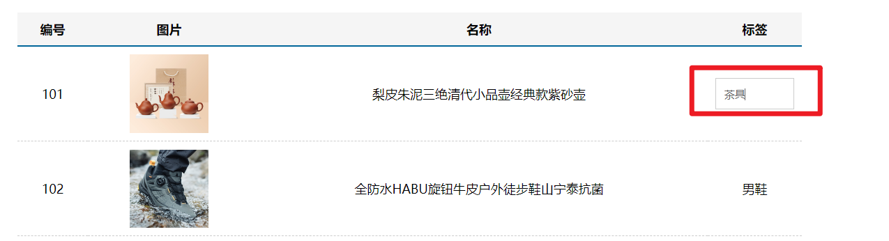
# 10.3.2 双击显示
- my-tag盒子注册双击事件
<div class="my-tag" @dblclick="open">
- 提供数据,利用v-if控制显示隐藏
<template>
  <div class="my-tag" @dblclick="open">
    <input
      v-if="edit"
      class="input"
      type="text"
      placeholder="输入标签"
    />
    <div v-else class="text">茶具</div>
  </div>
</template>

<script>
export default {
  data () {
    return {
      edit: false
    }
  },
  methods: {
    open () {
      this.edit = true
    }
  }
}
</script>
2
3
4
5
6
7
8
9
10
11
12
13
14
15
16
17
18
19
20
21
22
23
24
25
26
# 10.3.3 显示自动获取焦点
自定义指令 - 自动获取焦点
<template>
  <div class="my-tag" @dblclick="open">x`
    <input
      v-if="edit"
      v-focus
      class="input"
      type="text"
      placeholder="输入标签"
    />
    <div v-else class="text">茶具</div>
  </div>
</template>

<script>
export default {
  ...
  directives: {
    focus: {
      inserted (el) {
        el.focus()
      }
    }
  }
}
</script>
2
3
4
5
6
7
8
9
10
11
12
13
14
15
16
17
18
19
20
21
22
23
24
25
# 10.3.4 失去焦点自动隐藏
- 注册blur事件
<input
  v-if="edit"
  v-focus
  @blur="close"
  class="input"
  type="text"
  placeholder="输入标签"
/>
2
3
4
5
6
7
8
- 控制隐藏
close () {
  this.edit = false
}
2
3
# 10.3.5 控制表单文本绑定
两个数据区分:
注意1:输入框内显示的,是my-tag子组件内的数据
注意2:文本标签显示的,是父组件传递过来的数据
步骤:
- 父组件App.vue, v-model 绑定数据
<MyTag v-model="msg"></MyTag>

data () {
  return {
    ...
    msg: '测试标签'
  }
},
2
3
4
5
6
7
8
- 子组件MyTag.vue接收渲染
<div v-else class="text">{{ value }}</div>

props: {
  value: String
},
2
3
4
5
- 子组件MyTag.vue提供数据,并绑定
data () {
  return {
    edit: false,
    tag: '标签'
  }
},

<template>
  <div class="my-tag" @dblclick="open">
    <input
      v-if="edit"
      v-focus
      v-model.trim="tag"
      @blur="close"
      class="input"
      type="text"
      placeholder="输入标签"
    />
    <div v-else class="text">{{ value }}</div>
  </div>
</template>
2
3
4
5
6
7
8
9
10
11
12
13
14
15
16
17
18
19
20
21
- 双击显示时回显
open () {
  this.edit = true
  this.tag = this.value
},
2
3
4
- 回车时、失去焦点时提交
<input
  v-if="edit"
  v-focus
  v-model.trim="tag"
  @blur="close"
  @keyup.enter="close"
  class="input"
  type="text"
  placeholder="输入标签"
/>


close () {
  this.edit = false
  if (this.tag === '') {
    this.tag = '暂无'
  }
  this.$emit('input', this.tag)
}
2
3
4
5
6
7
8
9
10
11
12
13
14
15
16
17
18
19
# 10.4 封装 MyTable 组件
# 10.4.1 新建MyTable 组件
<template>
  <table class="my-table">
    <thead>
      <tr>
        <th>编号</th>
        <th>图片</th>
        <th>名称</th>
        <th width="100px">标签</th>
      </tr>
    </thead>
    <tbody>
      <tr>
        <td>101</td>
        <td><img src="https://yanxuan-item.nosdn.127.net/f8c37ffa41ab1eb84bff499e1f6acfc7.jpg" /></td>
        <td>梨皮朱泥三绝清代小品壶经典款紫砂壶</td>
        <td>
          标签
        </td>
      </tr>
    </tbody>
  </table>
</template>

<script>
export default {

}
</script>

<style lang="less" scoped>
.my-table {
  width: 100%;
  border-spacing: 0;
  img {
    width: 100px;
    height: 100px;
    object-fit: contain;
    vertical-align: middle;
  }
  th {
    background: #f5f5f5;
    border-bottom: 2px solid #069;
  }
  td {
    border-bottom: 1px dashed #ccc;
  }
  td,
  th {
    text-align: center;
    padding: 10px;
    transition: all .5s;
    &.red {
      color: red;
    }
  }
  .none {
    height: 100px;
    line-height: 100px;
    color: #999;
  }
}
</style>
2
3
4
5
6
7
8
9
10
11
12
13
14
15
16
17
18
19
20
21
22
23
24
25
26
27
28
29
30
31
32
33
34
35
36
37
38
39
40
41
42
43
44
45
46
47
48
49
50
51
52
53
54
55
56
57
58
59
60
61
62
# 10.4.2 父传子 - 传入数组 - 循环渲染
父组件
<MyTable :data="goods"></MyTable>
子组件
<template>
  <table class="my-table">
    <thead>
      <tr>
        <th>编号</th>
        <th>图片</th>
        <th>名称</th>
        <th width="100px">标签</th>
      </tr>
    </thead>
    <tbody>
      <tr v-for="item in data" :key="item.id">
        <td>{{ item.id }}</td>
        <td><img :src="item.picture" /></td>
        <td>{{ item.name }}</td>
        <td>
          {{ item.tag }}
        </td>
      </tr>
    </tbody>
  </table>
</template>

<script>
export default {
  name: 'MyTable',
  props: {
    data: {
      type: Array,
      default: () => [],
    },
  },
}
</script>
2
3
4
5
6
7
8
9
10
11
12
13
14
15
16
17
18
19
20
21
22
23
24
25
26
27
28
29
30
31
32
33
34
# 10.4.3 基本插槽处理
为了提高组件的复用性,最好把表格的 标题区域 预留为 <slot> 插槽,
方便使用者自定义表格的标题, 且内容部分要和标题部分对应, 所以也应该定义成插槽
<template>
  <table class="my-table">
    <thead>
      <tr>
        <slot name="head"></slot>
      </tr>
    </thead>
    <tbody>
      <tr v-for="item in data" :key="item.id">
        <slot name="row" :row="item"></slot>
      </tr>
    </tbody>
  </table>
</template>
2
3
4
5
6
7
8
9
10
11
12
13
14
# 10.4.4 表格封装完成
<template>
  <div class="table-case">
    <MyTable :data="goods">
      <template #head>
        <th>编号</th>
        <th>图片</th>
        <th>名称</th>
        <th width="100px">标签</th>
      </template>

      <template #row="{ row }">
        <td>{{ row.id }}</td>
        <td><img :src="row.picture" /></td>
        <td>{{ row.name }}</td>
        <td>
          <MyTag v-model="row.tag"></MyTag>
        </td>
      </template>
    </MyTable>
  </div>
</template>

<script>
import MyTag from './components/MyTag.vue'
import MyTable from './components/MyTable.vue'

export default {
  name: 'TableCase',
  data () {
    return {
      goods: [
        { id: 101, picture: 'https://yanxuan-item.nosdn.127.net/f8c37ffa41ab1eb84bff499e1f6acfc7.jpg', name: '梨皮朱泥三绝清代小品壶经典款紫砂壶', tag: '茶具' },
        { id: 102, picture: 'https://yanxuan-item.nosdn.127.net/221317c85274a188174352474b859d7b.jpg', name: '全防水HABU旋钮牛皮户外徒步鞋山宁泰抗菌', tag: '男鞋' },
        { id: 103, picture: 'https://yanxuan-item.nosdn.127.net/cd4b840751ef4f7505c85004f0bebcb5.png', name: '毛茸茸小熊出没,儿童羊羔绒背心73-90cm', tag: '儿童服饰' },
        { id: 104, picture: 'https://yanxuan-item.nosdn.127.net/56eb25a38d7a630e76a608a9360eec6b.jpg', name: '基础百搭,儿童套头针织毛衣1-9岁', tag: '儿童服饰' },
      ],
    }
  },
  components: {
    MyTag,
    MyTable
  }
}
</script>
2
3
4
5
6
7
8
9
10
11
12
13
14
15
16
17
18
19
20
21
22
23
24
25
26
27
28
29
30
31
32
33
34
35
36
37
38
39
40
41
42
43
44
